Designing Trust Into How Money Moves
What does it take for someone to hand a product their money?

Beam: Designing Trust Into How Money Moves
Product Design Lead · 2022–2023 · Crypto-to-Fiat Payments · Acquired by Modern Treasury
Employee #3 and founding designer. Took a crypto payments platform from zero to launch in three months and built the design foundation that made it worth acquiring.

Problem: Money Has to Feel Safe to Move
Beam was solving a real problem. Millions of people were holding crypto and couldn't get it out cleanly. Existing options were clunky, opaque, or required trusting a platform that felt nothing like a bank.
The founders, both payments executives from Visa, knew the rails. What they needed was a product that made those rails feel safe to someone who had never used them.
That was the brief. Three months to launch.
Discovery: Users Weren't Confused, They Were Nervous
Discovery at Beam was continuous. Every week, I ran user sessions with the lead engineer and PM sitting in. We weren't testing prototypes in a lab. We were watching real people try to move real money and adjusting based on what we saw.
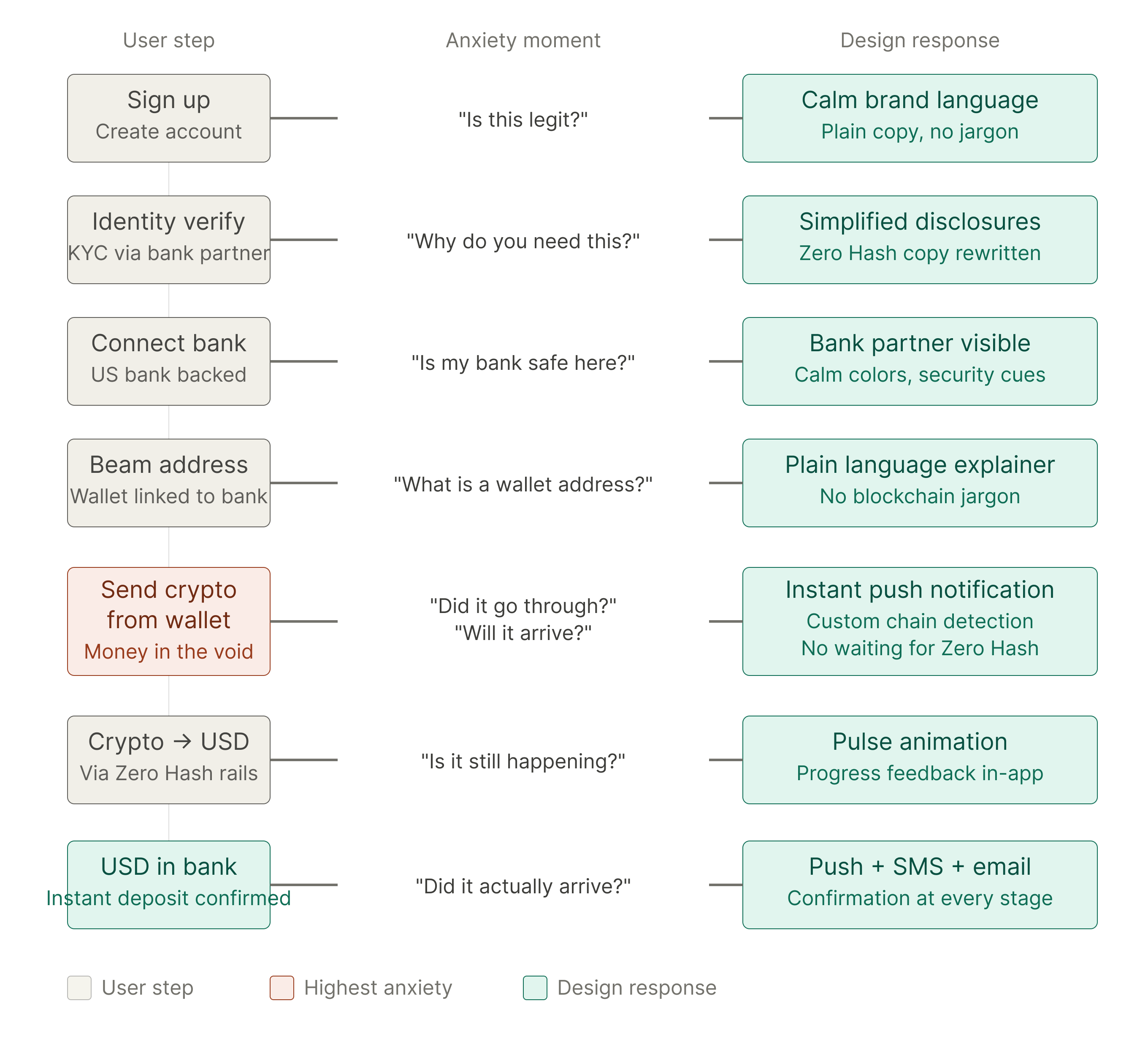
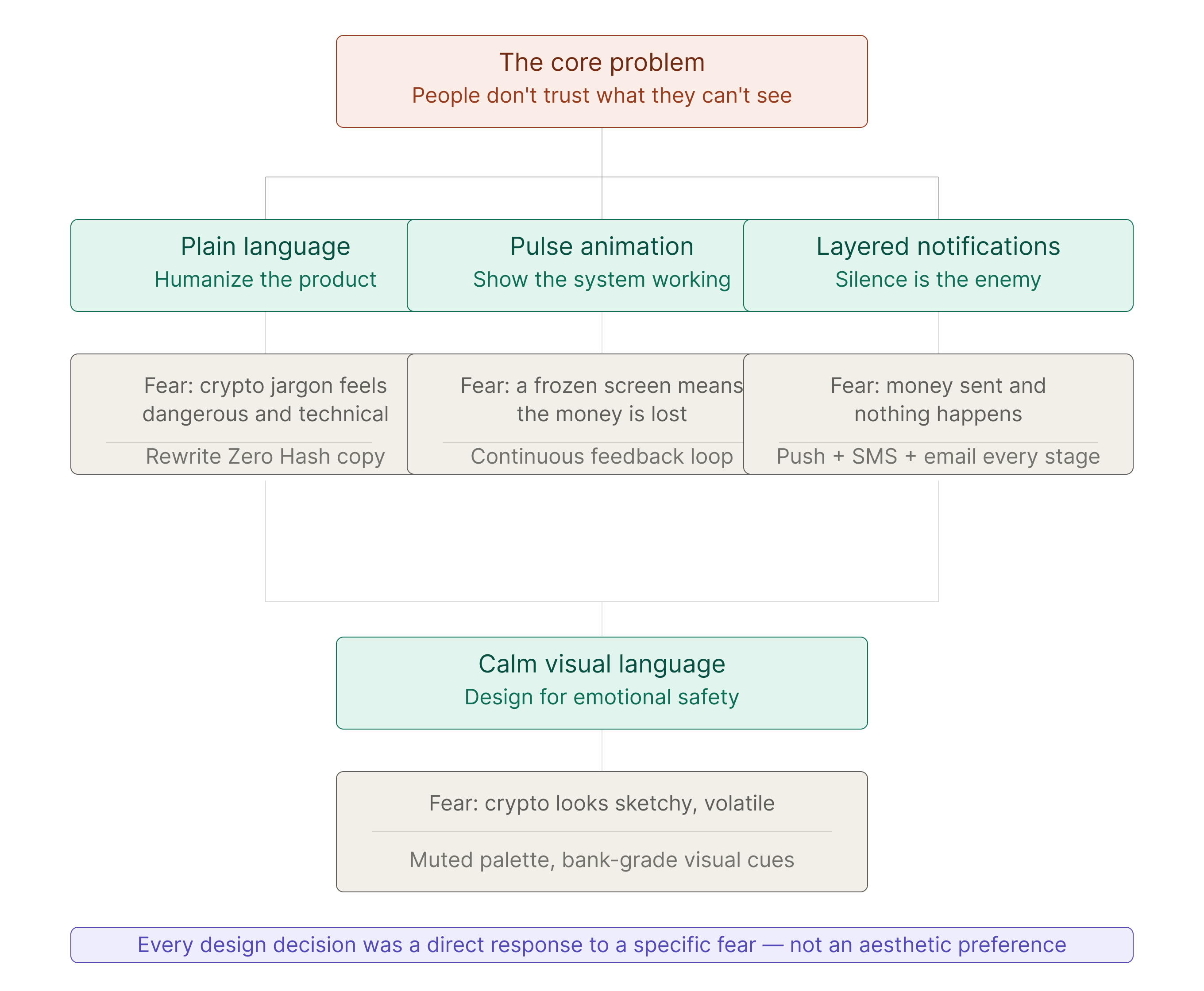
The pattern that kept emerging: users understood the flow. They just didn't trust that it would complete. There was a moment where money left their account and no confirmation had arrived yet. People froze. Not because anything was broken. Because the product went quiet at exactly the wrong time.

Exploration: Forty Iterations on One Screen
The core transaction flow went through more rounds than almost anything else I've worked on. We tested copy weekly. We tested the order of steps. We tested how much to tell users before asking them to commit.
A few things we ruled out early:
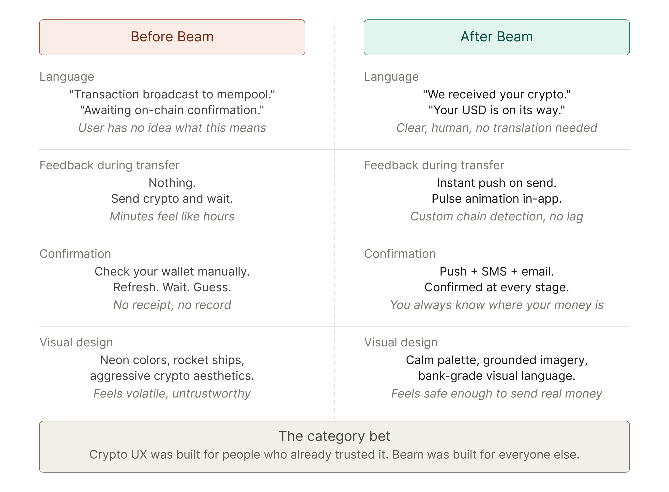
Crypto-forward framing made users more anxious, not less. Leaning into the technical language, wallets, keys, confirmations, signaled complexity. We moved toward plain language even when it felt too simple.
Progress indicators without feedback didn't help. Users needed to feel the system was working, not just see a bar move. Static UI during a live transaction read as frozen.
Minimalism at the wrong moments hurt confidence. There were places in the flow where we stripped things down and it made users feel like they'd made a mistake. The product needed to be calm, not sparse.
Decision: Calm Over Clever
The design direction we landed on was deceptively simple: the product should feel like it already knows what it's doing.
That meant no jargon. No friction that positioned itself as security theater. No empty states that left users guessing. Every moment where money was in motion, the product had to communicate, not just function.
Calm over clever. Reassurance over explanation. The product absorbs the complexity so users don't have to.
Iteration: Copy, Motion, Timing, Feedback
The trust architecture was built from small decisions stacked on top of each other.
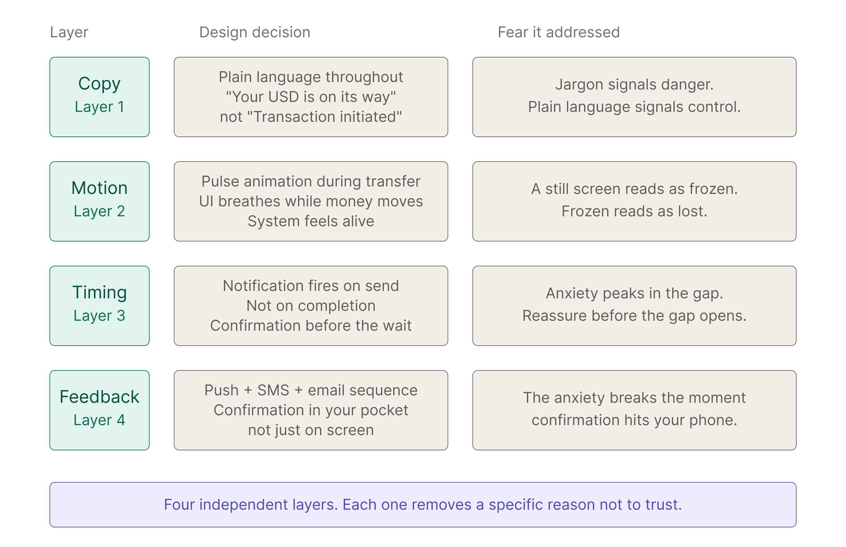
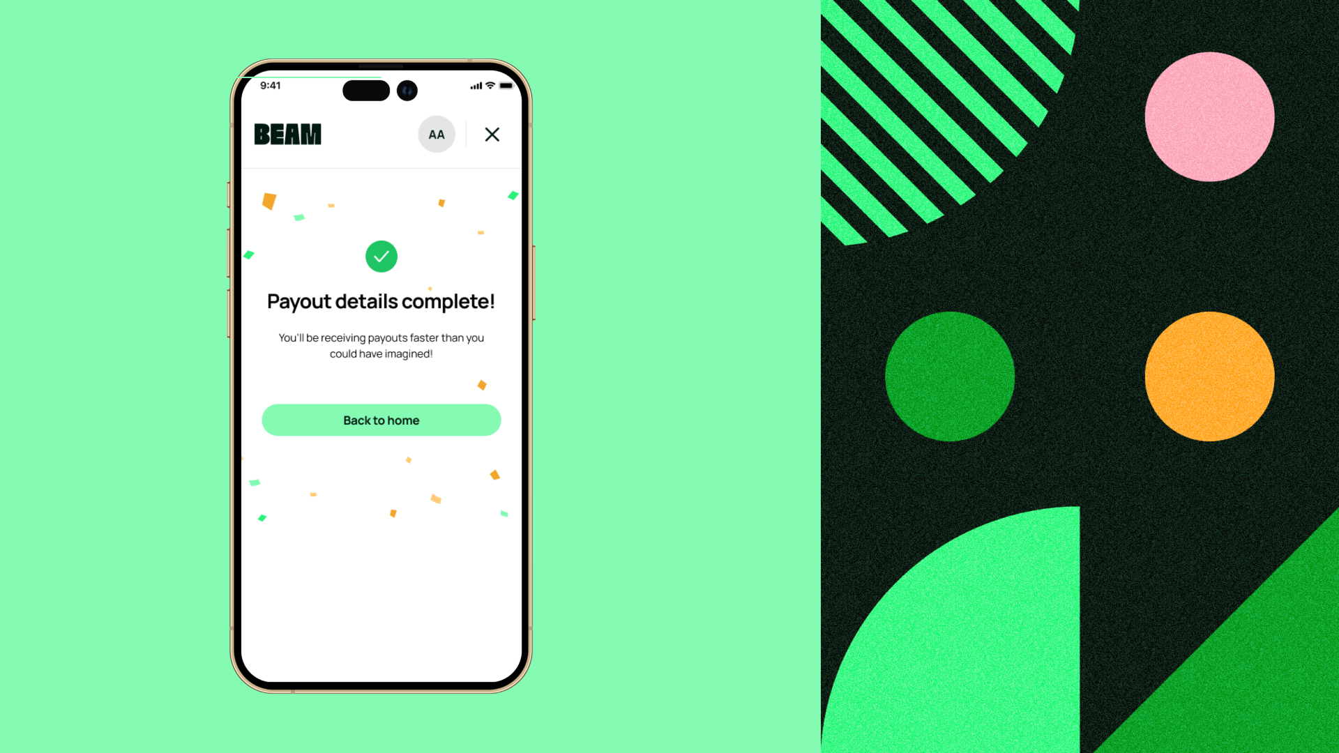
Copy was the first lever. We rewrote regulatory disclosures in plain language. We named things what they were. "Your money is on its way" instead of "Transaction initiated." Every label, every confirmation message, every error state went through the same lens: does this sound like a person who knows what they're doing, or a system covering its liability?
Motion was the second. When money was in transit, the UI needed to breathe. A pulse animation on the transfer state communicated that something was happening and the system was alive and working. It sounds small. Users noticed when it wasn't there.
Feedback timing was the third. Push notification, text, email. The sequence mattered. Users told us the moment they got confirmation in their pocket, the anxiety broke. The product didn't just need to work. It needed to tell you it worked, in the channel you'd actually check.
Final Product: A New Rail That Felt Like a Sure Thing
By launch, Beam's crypto-to-fiat flow was one of the cleanest in the space. Users could connect a wallet, verify identity, and move money to a US bank account in a handful of steps with full visibility at every point in the process.
The visual language was intentional: muted palette, generous whitespace, typography that did the heavy lifting. The product looked like it had been around for years on the day it launched.
Artists, investors, and institutions used it to move real money. It worked. People came back.
System Thinking: Designing a Trust System, Not Just Screens
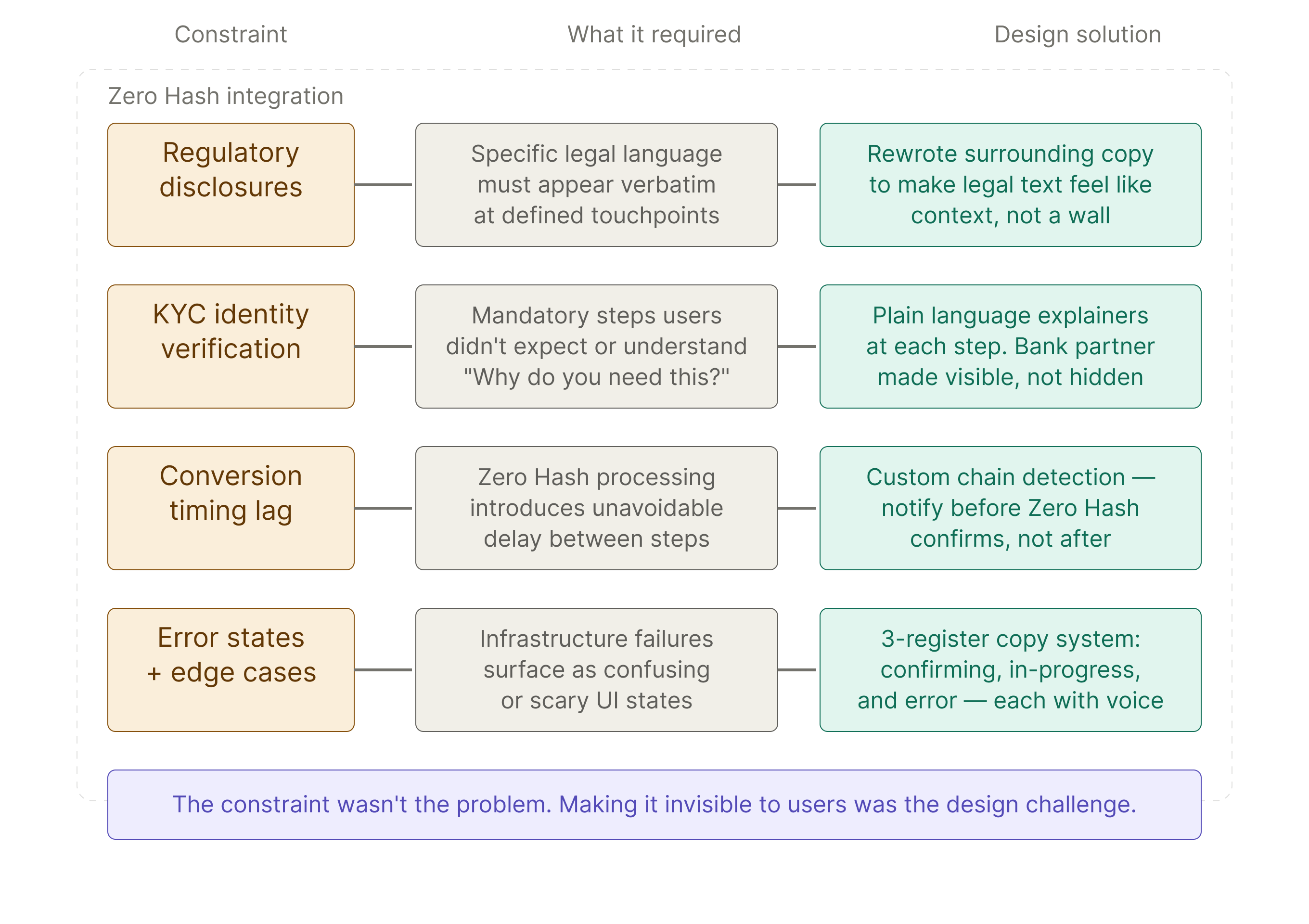
Beam processed transactions through Zero Hash, a regulated crypto infrastructure provider. That relationship came with hard constraints. Specific disclosures, identity verification requirements, and legal language that couldn't be removed or rewritten freely.
This is the kind of constraint that shows up in almost every product at scale. An API dependency, a compliance requirement, a third-party integration with its own opinions about what users see. The design question is never whether to include it. It's how to absorb it without making users feel the weight of it.
We worked directly with legal and engineering to separate what had to be said from what had to be shown. Plain language where we had flexibility. Clear visual hierarchy where we didn't. The result was a copy system that met every compliance requirement and still read like a product that respected its users.
That system scaled when we built the cross-border payment rails in phase two. Same constraints, same principles, new surface.
Impact: Launched in 3 Months, Acquired by Modern Treasury

Beam launched in December 2022. The product was live, users were transacting, and the team grew from three to fifteen in the first year.
The trust work wasn't incidental to the acquisition. A payments platform only acquires value when people trust it enough to use it repeatedly. Beam's design was built to earn that trust from the first session.
Modern Treasury acquired Beam in October 2025. The design foundation built in those first three months held all the way to the exit.

Reflection: What It Taught Me
If I were starting over, I'd treat the feedback architecture as a first-principles assumption rather than something we arrived at through iteration. The insight, that users need confirmation in their pocket and not just on screen, was always true. We found it through testing when we could have designed for it from the start.
The broader lesson is one I keep coming back to: naming and framing are design problems, not communication problems. At Beam, "transaction initiated" eroded trust. "Your money is on its way" built it. The words were doing the same functional job. The emotional job was completely different.
It's a pattern I'm watching play out in AI products right now. Features get named for how they work internally, what an engineering team would call them, and then that name ships. What's interesting is that the design problem is the same one we solved at Beam: how do you describe something unfamiliar in a way that makes people feel capable instead of confused? I don't think the industry has landed on the answer yet. That's exactly the kind of problem I want to be in the room for.